
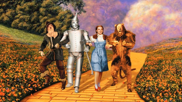
The scene is etched in your retina if you have the necessary cones and rods: Dorothy Gale wakes up from a nasty bump on her head, opens the door of her dull farmhouse with sepia tones, and enters an eye-popping world of brilliant primary colors, including emerald cities, ruby slippers, and yellow brick roads.
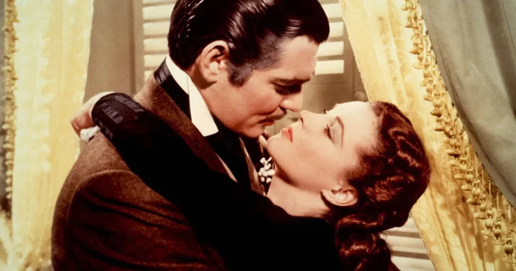
Not only are we no longer in Kansas, but we are also no longer in Hollywood—at least not in the typical black-and-white format of the year’s fifteen major pictures. The debut of Gone With the Wind in 1939, which had painterly swatches of shimmering golden-hour hues that made Oz appear gaudy, meant that the doorway into Oz did not open the curtain on cinematic color, nor was it the only film to showcase the polychromatic spectrum that year. However, The Wizard of Oz created the most striking contrast between two potential film worlds: a somber monochromatic Depression-scape and what was known as Glorious Technicolor (the modifier was practically a trademark).
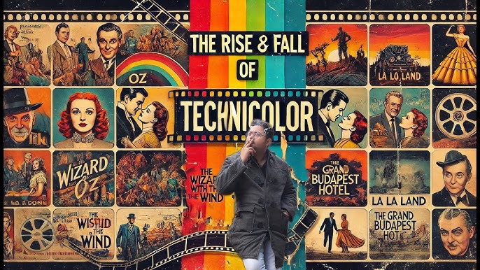
This one piece of language, the news of Technicolor’s recent decline, is the most recent sad death notice for a legendary Hollywood logo. When 22 of Hollywood’s 25 greatest box office hits were filmed in Technicolor in 1965, the word was added to Webster’s Dictionary, but with a tiny “t”—a reduction that would be rectified by a copyright attorney if it were used in a newspaper.
The spelling was always correct in Hollywood. In its heyday, Technicolor was spotlighted in posters and lobby cards with bright red, blue, and yellow letters, billed in the opening credits, and frequently commemorated with its own title card. When writer-director Preston Sturges sought to get Paramount to open Sullivan’s Travels (1941) with a title card that said “In Beautiful Black and White,” the studio rejected the idea because they were tired of the drumbeat of ballyhoo for movies shot “In Glorious Technicolor.”
Since the first daguerreotypes, full-spectrum color has been a dream for photographers, and early filmmakers were equally committed to creating a celluloid canvas that captured life in all its beauty. In order to capture the image in the camera on the celluloid film stock, silent filmmakers experimented with tinting (essentially pouring a negative into a container of dye) and coloring (manual stenciling, frame by frame). John J. Murdock, a pioneer of motion pictures, put $6 million into Kinemacolor in 1911. Kinemacolor used red and green filters in projection and photography. “Fringing,” or double imaging, which might cause a horse’s tail to seem green at first and later red, was a problem with the procedure.
Herbert T. Kalmus, a talented chemical engineer with training from MIT and the University of Zurich, created Technicolor, the first workable and profitable solution. He established the Technicolor Motion Picture Corp. in 1915 and dedicated himself to the advancement of color photography in both meanings of the word, much like Edison did. The Toll of the Sea (1922), a miscegenetic melodrama directed by Chester Franklin and produced by Joseph and Nicholas Schenck, featured an early example of Technicolor (“a double coated relief image in dyes”), starring 18-year-old Anna May Wong, whose own colors were neither black nor white. Billboard noted, “The silks and the kimonos registered perfectly.” “There aren’t any offensive elements present in this film that were present in other color productions. “There are no raw fringes [and] no quivering flashes of red.” In addition to short scenes in Ben-Hur (1926) and The Phantom of the Opera (1925), Douglas Fairbanks’ illogically named The Black Pirate (1926) also helped to promote the Technicolor brand. Fairbanks and Kalmus were unable to “imagine piracy without color.”
In an effort to commercialize Technicolor, Kalmus kept trying out various filming and developing methods, gradually enhancing dye transfer and color registration. He and his team created a unique Technicolor camera in 1926 that separated red and green light onto a single strip of black and white film using a beam splitter. Technicolor historians attribute many of the major innovations to the talented scientists and technicians he hired. The Technicolor lab’s developing phase then employed what Kalmus (who apparently assumed that everyone shared his knowledge of dye transfer systems) called a “two-component subtractive inhibition process,” in which the colored dye was “imbibed”—that is, absorbed—to produce the negative from which prints were to be made.
For a while, the two-color Technicolor process was incredibly popular. Kalmus noted that technicolor cameras “operated day and night.” He estimated that during the two-color boom, some 40 shorts and features were made, including King of Jazz (1929), which starred cultural appropriator Paul Whiteman; Whoopee! (1930), featuring Eddie Cantor, a bawdy-eyed comedian; and Mystery of the Wax Museum (1933), produced by Warner Bros. However, garishness and graininess put an end to the trend. “It hurts the eyes,” moviegoers said.
When Technicolor VP and technical director J. developed the three-strip Technicolor process in 1932, it was a major advance. The format commonly referred to as traditional Technicolor is Arthur Ball. To avoid becoming overly technical (if I may), the three-strip Technicolor technique involved exposing three negatives in the camera, each of which ran behind a single lens. The light from the image was then divided onto the three distinct negatives, which were blue, red, and green, respectively, by a prism. The three dyes were applied separately to the film basis for the “imbibition” process in the developing lab using a technique similar to lithographic dye printing (hence the less tongue-twisting shorthand “IB Technicolor”). An admirer described his as “a complete studio and laboratory service, from filming to the production of release prints,” which was Technicolor’s pinnacle configuration.
The challenge was to persuade Hollywood to take a chance on the incredibly precise and pricey process (three to four times more expensive than dependable black and white); rent Kalmus’ Technicolor cameras (which weighed 750 pounds and cost $30,000); and use his Technicolor laboratories.
Kalmus’s first significant client was the visionary Walt Disney. Disney secured a deal in 1932 to create the upcoming Silly Symphonies cartoons in Technicolor, which paid off ahead of schedule as the seven-minute Flowers and Trees (1932) won a special Academy Award. Variety remarked, “Easy on the eyes.” “Perhaps the color technicians can explain why that is.” Nevertheless, the Disney animated feature that solidified Technicolor as the preferred animation method was The Three Little Pigs (1933), a Great Depression hit in which the Big Bad Wolf sulks until he is actually blue in the face. The following year, John Hay Whitney, the head of Pioneer Pictures, defeated Disney to create La Cucaracha (1934), the first live-action musical short in Technicolor, which “flooded the screen with rich and glowing color harmonies never before realized!””
READ MORE: Lexus Uptown Honors Hollywood Celebrates Long-Standing Black Cultural Innovators In Film And TV
Naturally, the hardest market to break into was the live-action feature film. Once more, Whitney took the risk with Rouben Mamoulian’s picaresque story of “a late Napoleon-era strumpet,” Becky Sharp (1935). On the eve of the Battle of Waterloo, Mamoulian showcased his new watercolors in a lavish ballroom scene that featured troops strutting in brilliant red uniforms and women twirling in blue, green, and yellow costumes. Audiences in awe erupted in unplanned cheers. According to Mamoulian, “the motion picture industry has up until now been like an artist allowed to use only pencil.” “Technicolor has given us paints.” New York Post reviewer Becky Sharp heard “the death knell of black and white pictures” while watching.
Although the obituary was premature, Technicolor made steady growth over the following few years, primarily in escapism-trafficking genres like animation, musicals, costume dramas, and travelogues. The multicolored fashion parades in Walter Wanger’s Vogues of 1938 (1937) garnered more positive reviews than the drab musical parts. The success of The Goldwyn Follies (1938) inspired an ecstatic Sam Goldwyn to promise that all of his future films would be in Technicolor, a promise he later broke. Errol Flynn in tights was the main attraction for The Adventures of Robin Hood (1938), but viewers were also encouraged to enjoy at least 1,182 Technicolored “figures in flowing capes, brocade vestments, and various shades of satin.”
1937’s Snow White and the Seven Dwarfs. Walt Disney Pictures/Everett Collection permission
The first feature-length Technicolor cartoon, Disney’s Snow White and the Seven Dwarfs (1937), was advertised as being produced “in marvelous multiplane Technicolor,” which means that the camera was positioned to shoot downward with the lens above the horizontal drawing board to create the appearance of depth.
Natalie, Herbert Kalmus’s wife, was the high priestess of Technicolor’s aesthetic traditions, if Kalmus was the technological genius behind it. She established the rules for the appropriate usage of the color scheme while serving as the head of Technicolor’s Color Advisory Service. In 1939, The New York Times praised Natalie as the “ringmaster to the rainbow” and “chatelaine of three Technicolor factories.” (Herbert and Natalie had a complicated relationship; they were married in 1902 and divorced in 1921, but they continued to live and work together.) Natalie presumably chose to stay active with a day job in lieu of community property: She brought the camera, the film stock, and the lab.
According to all accounts, Mrs. Kalmus had a strong personality and strong beliefs, which made her unpopular with directors, art directors, and set designers. She followed her own big theories of “color separation” and “laws of emphasis,” which dictated that color should never overpower a film’s dramatic mood. Kalmus created a well-known chart that linked particular colors to different emotions. Green was “both a sedative and a stimulant depending on the person,” blue “represents peace harmony and home,” and scarlet was “the come-hither color.” Photoplay released her color codes so housewives and shopgirls, like movie stars, could receive “the right color vibrations which will help you along the road to success and happiness.”
READ MORE: After Hollywood Strikes, L.A. City Council Decides To Speed Up Film And Television Production
The color scheme of the mise-en-scène should be based on the appearance of the lead actress, including her hair, eyes, complexion, and wardrobe, according to Rule No. 1 of Hollywood’s star system. Some women performed better with the new lens than others, much like with the switch to sound, to which the introduction of Technicolor was frequently likened. Maureen O’Hara’s brilliant emerald eyes and opulent red hair were ideal for a three-strip closeup. Rita Hayworth, another redhead, was praised as “nature’s gift to Technicolor.” She was not to be confused with green-eyed brunette Yvonne De Carlo, who was “Hollywood’s Number One Technicolor Girl,” or with Joan Bennett, who was then blonde and was “god’s gift to the Technicolor cameraman.” Joan Crawford, another natural redhead, did not shimmer in Technicolor; instead, she had a face for black and white.
The old-school Hollywood directors, who were all old-school, were naturally annoyed by Kalmus’ big-foot meddling. While filming Gold Is Where You Find It (1938), Michael Curtiz, an irascible Hungarian import, shouted, “Mrs. Don’t take my goddamn photo, Kalmus!”
Filmmakers rebelled against the Kalmus guidelines as they grew more assured of their own Technicolor vision. The seasoned cinematographer Stanley Cortez recalls, “Technicolor wanted light everywhere, under the table, and God knows where else.” In order to achieve the necessary results in the lab, producer David O. Selznick and costume designer Walter Plunkett went over Kalmus’ head to Herbert because they thought her suggested costumes for Gone With the Wind were just too dull. With startling effects, Vincente Minnelli disregarded Kalmus’ suggestion to soften it for Meet Me in St. Louis (1944). Film critic James Agee observed, “Technicolor has seldom been more affectionately used than in its registration of the sober mahoganies and tender muslins and benign gaslights of the period.”
Even World War II did not halt the annual increase in Technicolor picture output, with 50 planned for 1944–45. As if the prestige format should not be limited to Hollywood entertainment, Technicolor was utilized to elevate America’s soldiers, despite the fact that the motion picture memory of the war is in newsreel black and white. Combat reports produced by the military, such At the Front in North Africa with the U.S. After being filmed on the battlefield, Army (1942), The Battle of Midway (1942), With the Marines at Tarawa (1944), and To the Shores of Iwo Jima (1945) all received the full 35mm Technicolor treatment. (Because the color film stock could be refrigerated on battleships, the Pacific Theater received more color coverage than the European Theater.)
The 1944 poster for Memphis Belle. Thanks to the Everett Collection
William Wyler’s The Memphis Belle (1944), which tells the tale of a B-17 on its 25th mission over Nazi Germany, was by far the most well-liked of the Technicolor combat movies. The 16mm Kodachrome film, which was captured on handheld Cine-Kodak cameras, was enlarged to 35mm and processed in Hollywood’s Technicolor facility. The Hollywood Reporter explained that fifty prints were produced for what was marketed as “the Technicolor saga of our air heroes.” “If the color quality is lower than that of the standard Technicolor brand, it is understandable since the camera boys were never able to get set for the fast and furious action they were seeing before them,” the report said.
When Kalmus’ peculiar relationship with Herbert turned into a legal issue in 1950, her reign as queen bee of Technicolor came to an end. She lost her right to be a full partner in Technicolor after the matter reached the Supreme Court, which decided in 1952.
The removal of Natalie Kalmus caused Technicolor swatches to lose all self-control. Its brushstrokes were used to entice viewers away from the pathetically small black and white square in the living room in the 1950s, combined with widescreen spectacle and casts of hundreds. Cole Porter’s song “Glorious Technicolor, Breathtaking Cinemascope, and Stereophonic Sound,” which was only two-thirds self-reflexive due to its Metrocolor production, was a memorable parody of the technique in MGM’s 1957 musical Silk Stockings.
In the 1950s, a number of competing color processes arose to compete with Technicolor, including Metrocolor (also see Warnercolor). The majority were variations of Kodak’s 1950 Eastmancolor. Eastmancolor employed a single-color negative with three light-sensitive emulsions, which was more affordable and practical. The new color processes outperformed the old ones in tandem with competing development labs that employed less costly but more unstable dyes.
Foxfire (1955), starring the silver-haired Jeff Chandler and the raven-haired Jane Russell, was the final American film produced using the traditional Technicolor technique. Reviews and advertisements failed to note that it signaled the end of the three-strip Technicolor period.
Being Kalmus, he came up with a new method to rival Eastmancolor. In a 1955 business history for The Hollywood Reporter commemorating Technicolor’s 40th anniversary, he emphasized that “the introduction of an improved new Technicolor process is a milestone not a terminus.” The imbibition method was kept for striking prints, but his new Technicolor camera only needed one negative.
However, the format of the future was Eastmancolor. The fadeout for Technicolor was gradual. “Color by Technicolor” or “Prints by Technicolor,” the Technicolor imprint found on the ensuing films, did not necessarily refer to the full-service camera-to-lab process; rather, it just identified the lab work. In the 1970s, Technicolor closed its labs in Hollywood, Rome, and London after being ultimately overtaken by the lowball alternatives. Variety couldn’t help but use the headline, “Technicolor Sells Plant to Red Chinese,” when the London plant auctioned off its equipment to China.
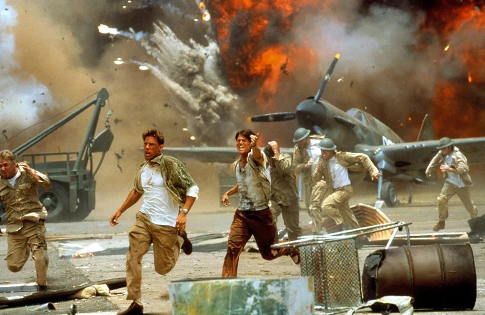
2001’s Pearl Harbor. Thanks to the Everett Collection
However, the original Technicolor dye transfer technique was brought back to life and improved for Batman and Robin (1997) after a 20-year break. It was later utilized in a few additional movies, including Godzilla (1998), Toy Story 2 (1999), and Pearl Harbor (2001). When Thomson Multimedia bought the business and shut it down in 2001, the brief renaissance came to an end.
By that time, celluloid and the imbibition process were being replaced by digital technologies. James Layton, archivist at the George Eastman House and co-author of The Dawn of Technicolor 1915-1935, released in 2015, regrets that “the [Technicolor] technology is basically extinct.” Layton compares each Technicolor print to a unique piece of art that hangs in a museum. It cannot be replaced once it is gone.
However, Technicolor received a form of posthumous retribution. While ancient Eastmancolor from 1950 to 1975 bleeds into washed-out pinks, a vintage Technicolor print maintains its sparkle and color separation. The anguish of viewing a retrospective in inglorious Eastmancolor was described by director Martin Scorsese in 1980. He trembled and said, “It was a horror show—an absolute horror show.”
Film historian Fred E. Basten dedicates his priceless book Glorious Technicolor: The Movies’ Magic Rainbow, published in 1980, to “the future millions [of moviegoers] who probably will never see that glorious color on the motion picture screen.” The only way to witness the glory that was Technicolor is to locate a repertory house or museum that has the resources and color consciousness to mount a series on the lost art. Today, a whole generation of moviegoers may never have seen a 35mm Technicolor print shining through the gates of a projector. For instance, in 2024, Quentin Tarantino’s personal collection of IB Technicolor films was shown for a month at the Vista Theater in Los Angeles.
One affected group of moviegoers, approximately 8% of men and 1% of women, has a unique incentive to seek out the format: color-blind individuals claim to be able to perceive color gradations in a Technicolor picture that they are unable to see in real life. Believe me.
Step into the ultimate entertainment experience with Radiant TV! Movies, TV series, exclusive interviews, live events, music, and more—stream anytime, anywhere. Download now on various devices including iPhone, Android, smart TVs, Apple TV, Fire Stick, and more!